Data Source
Based on the following data set ‘Police Incidents’ from Dallas Open Data.
To explore the Dallas Murder data more yourself, check out my Shiny app here.
The code behind this blog post is on GitHub here.
Data refresh date: 1-9-2021
Load data directly from DallasOpenData using Socrata API:
PI <- read.socrata("https://www.dallasopendata.com/resource/qv6i-rri7.csv")

setDT(PI)
Analysis
Ok, let’s get to work.
First, let’s extract murder incidents by looking for “MURDER” or “HOMICIDE” in various columns used to describe the incident.
Murder <- PI[grepl("MURDER",offincident) | grepl("HOMICIDE",offincident) | grepl("MURDER",ucr_offense) |
                 grepl("HOMICIDE",nibrs_crime_category) | grepl("MURDER",nibrs_crime),]
Murder[,Date := as.Date(substr(date1,1,10))]

# Add Dates and Incidents / Day & Month counts
Murder[,MonthDate := as.Date(paste0(format(Date,"%Y-%m"),"-01"))]
Murder[,WeekNum := strftime(Date, format = "%V")]
Murder <- merge(Murder,Murder[,head(.SD, 1L),.SDcols = "Date",by = c("servyr","WeekNum")],by = c("servyr","WeekNum"))
setnames(Murder,old = c("Date.x","Date.y"),new = c("Date","WeekDate"))

setorder(Murder,Date)

Murder[,NumPerDay := .N,by = Date]
Murder[,NumPerWeek := .N,by = WeekDate]
Murder[,NumPerMonth := .N,by = MonthDate]
First let’s smooth the rates per day, week, month…
# Smooth Murder Rates for plotting
Murder[,SmoothNumPerDay := predict(smooth.spline(NumPerDay,df = 20))$y]
Murder[,SmoothNumPerWeek := predict(smooth.spline(NumPerWeek,df = 55))$y]
Murder[,SmoothNumPerMonth := predict(smooth.spline(NumPerMonth,df = 10))$y]
Now let’s take a look at Murder Rates per Month over the last few years.
ggplot(Murder) +
    geom_line(aes(x = MonthDate,y = SmoothNumPerMonth,color = "red"),size = 1) +
    geom_point(data = Murder,aes(x = Date,y = NumPerMonth)) +
    geom_line(aes(x = Date,y = SmoothNumPerDay,color = "blue")) +
    ggtitle("Dallas Murder Rates since 2014") + ylab("# Murders") +
    scale_colour_manual(name = '',values = c('blue'='blue','red'='red'),
                        labels = c('Per Day','Per Month')) +
    theme(legend.position = "top",plot.title = element_text(hjust = 0.5))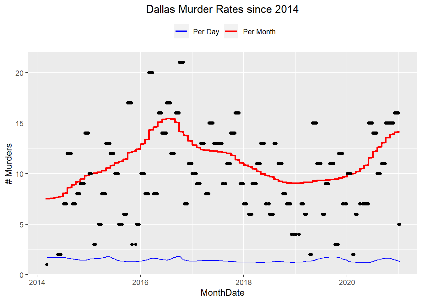
Yes - it definitely looks like there’s an uptick in the last few months of 2020!
Now let’s try to get an idea of Dallas PD staffing levels. We’ll do this by finding the avg number of unique badge #’s per month that are involved in the Police Incidents data set.
PI Badge Analysis
PI[,Date := as.Date(substr(date1,1,10))]
PI[,MonthDate := as.Date(paste0(format(Date,"%Y-%m"),"-01"))]

NumOfficers <- data.table(MonthDate = unique(PI$MonthDate))
for (m in NumOfficers$MonthDate) {

    NumOfficers[MonthDate == m,NumOfficers :=
                    length(unique(c(
                        PI[MonthDate == m,unique(ro1badge)],
                        PI[MonthDate == m,unique(ro2badge)],
                        PI[MonthDate == m,unique(assoffbadge)]
                    )))]

}

# We filter because the older data is very low...either faulty or they didn't keep track.
NumOfficers <- NumOfficers[MonthDate >= as.Date("2014-06-01") & MonthDate < as.Date("2021-01-01"),]
setorder(NumOfficers,MonthDate)
plot(NumOfficers$MonthDate,NumOfficers$NumOfficers,type = "l")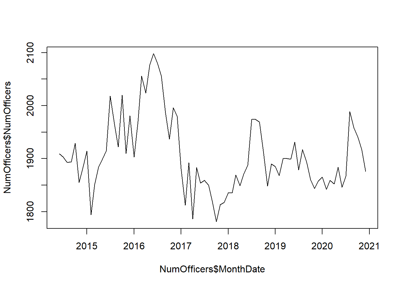
# Merge this in with the Murder Data
Murder <- merge(x = Murder,y = NumOfficers,by.x = "MonthDate",by.y = "MonthDate")
Now let’s plot the Murder rate against the DPD staffing levels.
ggplot(Murder) +
    geom_line(aes(x = MonthDate,y = SmoothNumPerMonth,color = "red"),size = 1) +
    #geom_point(aes(x = Date,y = NumPerMonth,color = "Red")) +
    geom_line(aes(x = MonthDate,y = NumOfficers/120,color = "blue"),size = 1) +
    ggtitle("Dallas Murder Rates since 2014") + ylab("# Murders") +
    scale_colour_manual(name = '',values = c('blue'='blue','red'='red'),
                        labels = c('# Officers Making Arrests in DPD Per Month','Dallas Murders Per Month')) +
    theme(legend.position = "top",plot.title = element_text(hjust = 0.5)) +
    scale_y_continuous(name = "Num Murders Per Month",
        sec.axis = sec_axis(~ .*180, name = "Num Officers")
    ) +
    theme(axis.text.y.left = element_text(colour = "red"),
          axis.text.y.right = element_text(colour = "blue"),
        axis.title.y.left = element_text(color = "red"),
        axis.title.y.right = element_text(color = "blue"))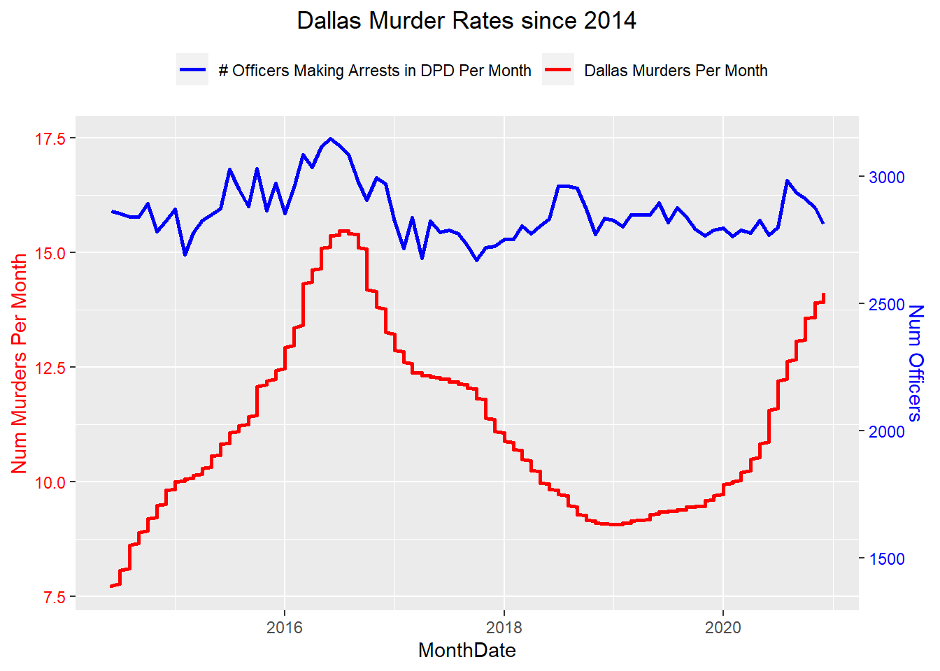
Interesting! During the 2016 uptick in violent crime, DPD staffing levels increased as well, and peaked right before the murders peaked, but they seem to have remained more flat during the 2020 increase in murders.
Let’s take a look at the same data, but bin it by week instead of month:
ggplot(Murder) +
    geom_point(aes(x = WeekDate,y = NumPerWeek)) +
    geom_line(aes(x = WeekDate,y = SmoothNumPerWeek),color = "red") +
    ggtitle("Murder Rates per Week") + ylab("# Murders")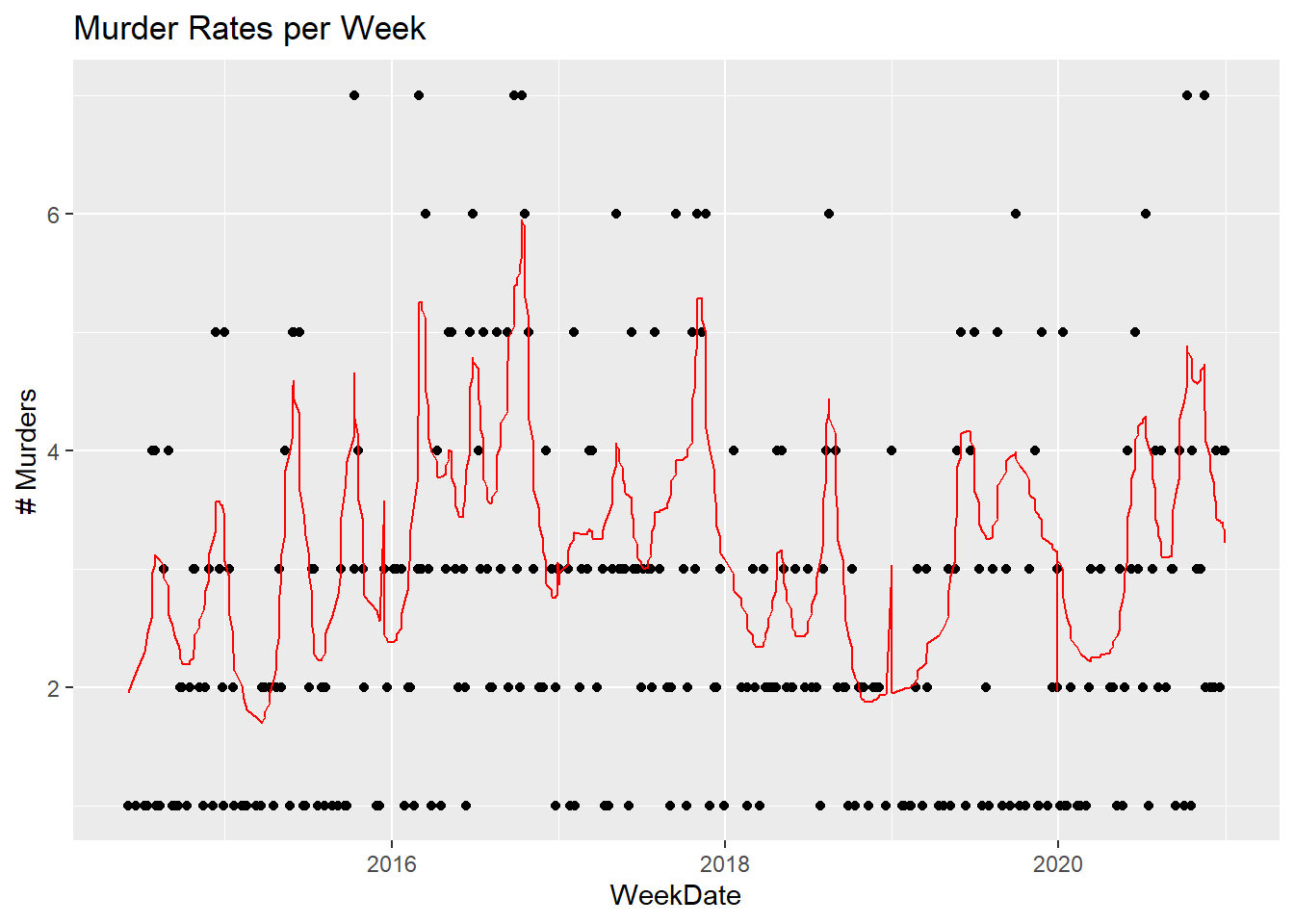
The rates look even worse when binned by week - because a few incidents were concentrated?
ggplot(Murder[Date >= as.Date("2020-06-01"),]) +
    geom_point(aes(x = Date,y = NumPerDay)) +
    geom_line(aes(x = WeekDate,y = SmoothNumPerDay),color = "red") +
    ggtitle("Murder Rates per Day") + ylab("# Murders")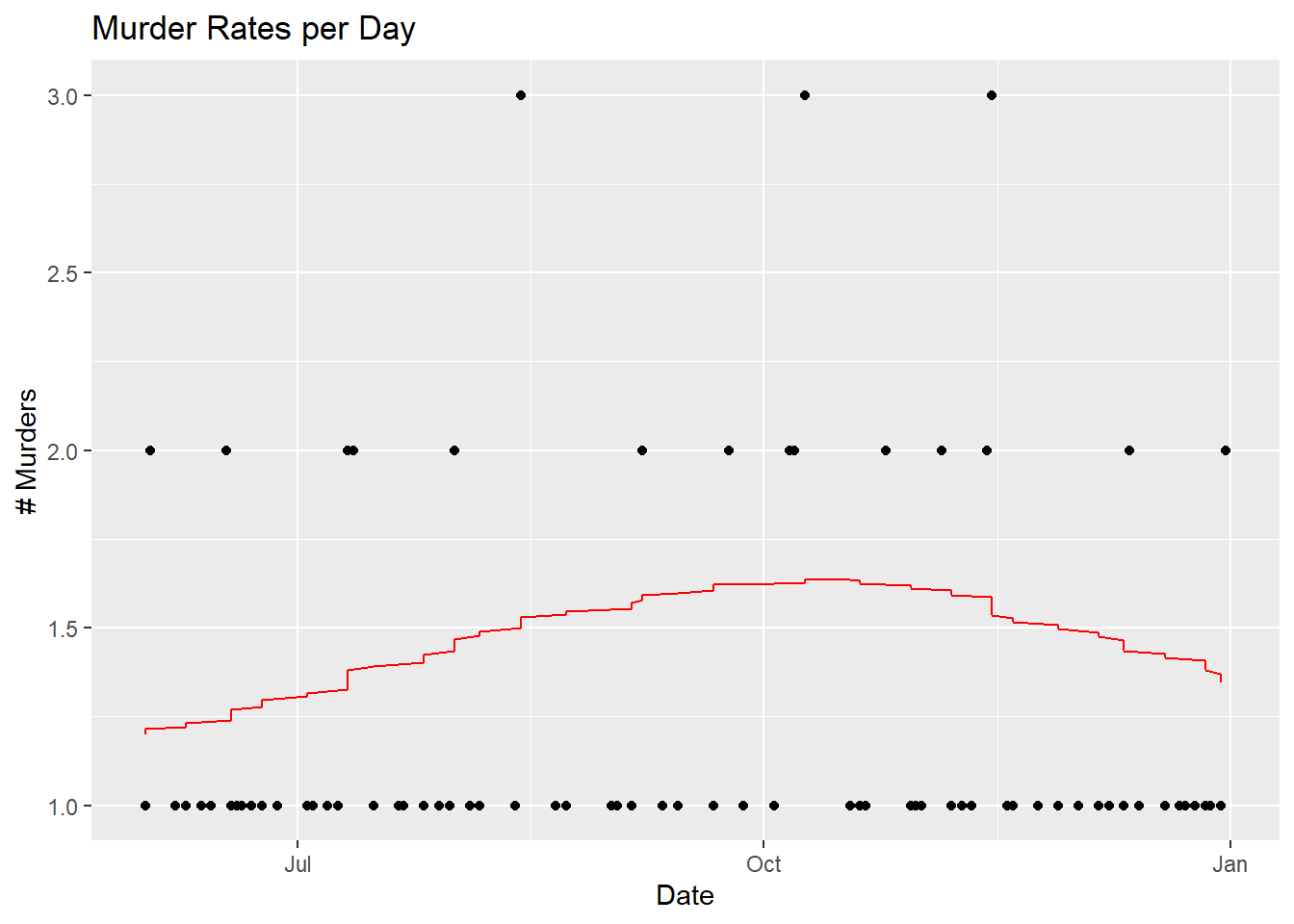
It looks like there’s been several days of 3 murders/day recently, which is the spike in the weekly chart.
Let’s look at just 2020:
ggplot(Murder[Date > as.Date("2020-01-01"),],aes(x = MonthDate)) + geom_bar() +
    ylab("# Murders per Month") + ggtitle("2020 Murders Per Month") +
    geom_text(aes(x = MonthDate,y = NumPerMonth,label = NumPerMonth),vjust = -0.25)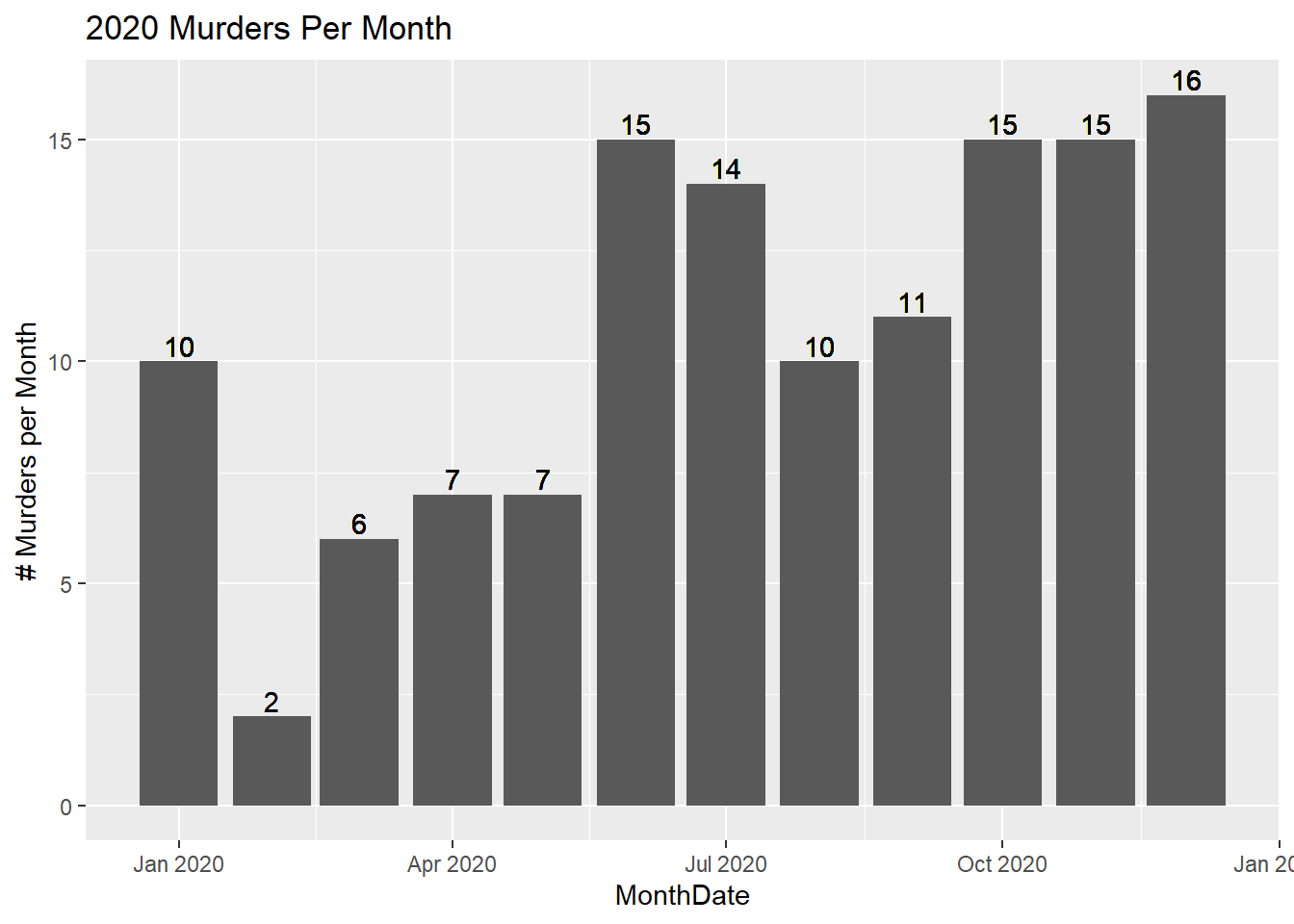
The data also includes something called “offincident”, which is likely Offense Type. Let’s take a look:
# Plot by Incident Type
table(Murder$offincident)
##
## CAPITAL MURDER BY TERROR THREAT
## 126
## CAPITAL MURDER OF MULTIPLE PERSONS
## 35
## CAPITAL MURDER WHILE REMUNERATION
## 1
## CRIMINAL NEGLIGENT HOMICIDE
## 106
## HOMICIDE
## 15
## HOMICIDE (POLICE SHOOTING)
## 7
## MANSLAUGHTER
## 11
## MANSLAUGHTER - TRAFFIC FATALITY - RECKLESS DRIVING
## 1
## MURDER
## 477ggplot(Murder[!(offincident %in% c("CAPITAL MURDER WHILE REMUNERATION",
"CRIMINAL NEGLIGENT HOMICIDE (DISTRACTED DRIVING"))]) +
geom_bar(aes(x = MonthDate)) + facet_wrap(~ offincident)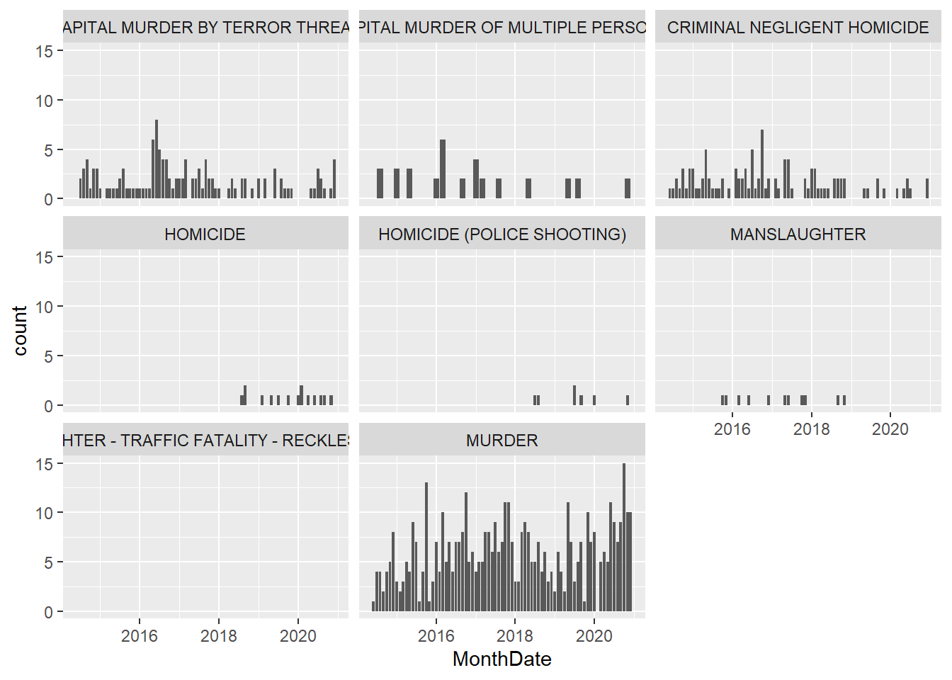
Some interesting codes, especially “Capital Murder by Terror Threat”. Police shootings seem very low.
The data also includes some information about the victim race.
# Victim Rate per Race
Murder[,NumPerRace := .N,by = comprace]
Murder[,PercentPerRace := round(100*.N/nrow(Murder),digits = 0),by = comprace]
Murder[,PercentPerRace := paste0(PercentPerRace,"%")]
ggplot(Murder) + geom_bar(aes(x = comprace)) +
    scale_x_discrete(labels = function(x) str_wrap(x, width = 10)) +
    xlab("") + ylab("# per Victim Race") +
    geom_text(aes(x = comprace,y = NumPerRace,label = PercentPerRace),vjust = -0.25) +
    ggtitle("Victim Count by Race")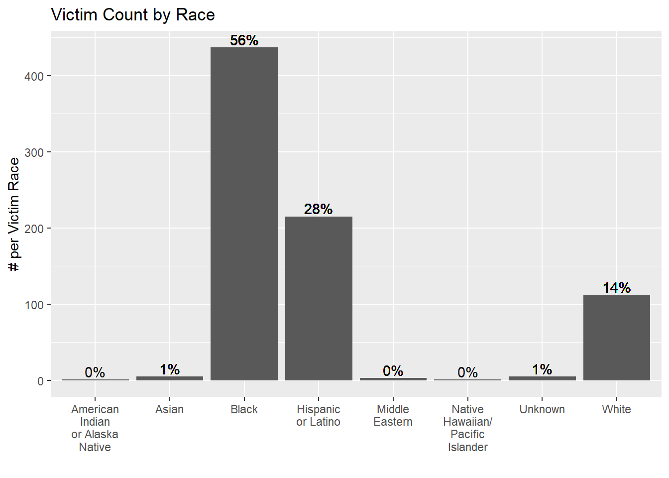
Let’s take a look at the Victim Rate per Police Shift Dallas Police Watch to Time Reference: https://www.dallaspolice.net/joindpd/Pages/SalaryBenefits.aspx
Murder[,NumPerWatch := .N,by = watch]
Murder[watch == 1,Shift := "11pm - 7am"]
Murder[watch == 2,Shift := "7am - 3pm"]
Murder[watch == 3,Shift := "3pm - 11pm"]
Murder$Shift <- factor(Murder$Shift,levels = c("11pm - 7am", "7am - 3pm", "3pm - 11pm"))
ggplot(Murder,aes(x = Shift)) + geom_bar() +
    xlab("") + ylab("# per Shift") + geom_text(aes(x = Shift,y = NumPerWatch,label = NumPerWatch),vjust = -0.25) +
    ggtitle("Murder Rate per Shift")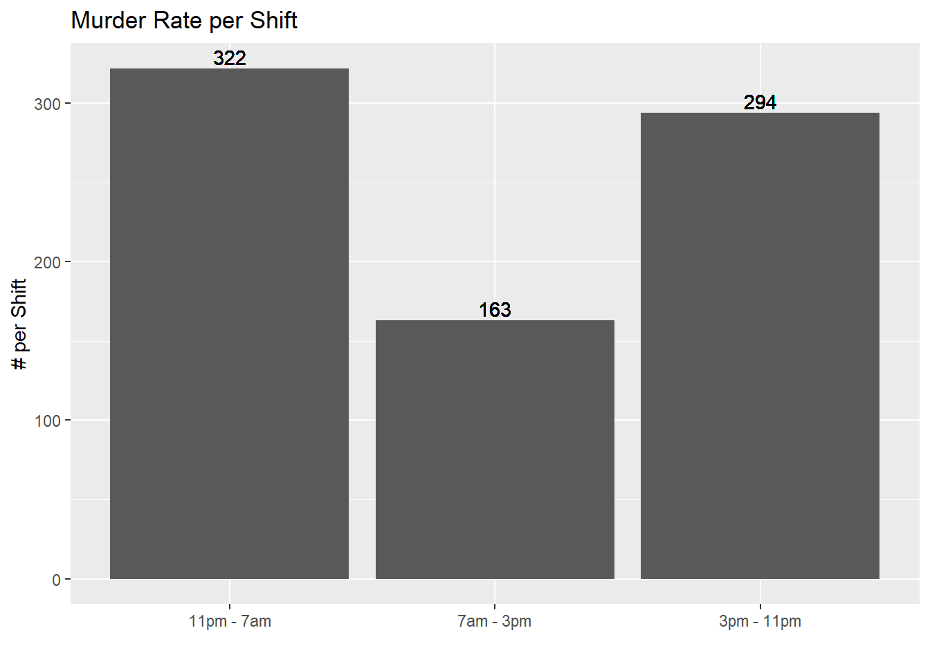
Most murders occur between 11pm and 7am. No suprises there.
Age distribution of victims per year:
ggplot(Murder,aes(x = compage)) + geom_histogram(bins = 10) + facet_wrap(~ servyr)## Warning: Removed 22 rows containing non-finite values (stat_bin).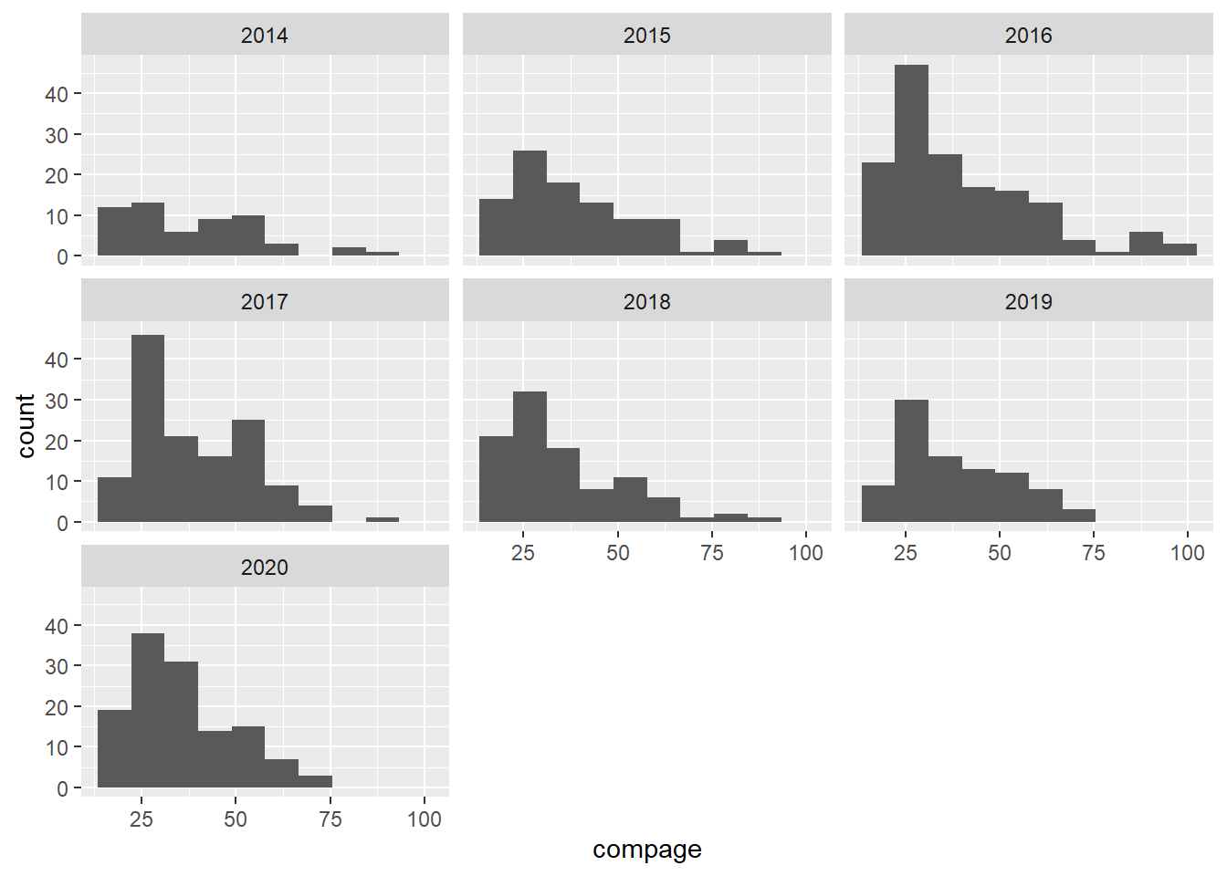 Looks like the ages of the victimes are left-skewed towards younger victims, peaking in the 20’s.
Sex distrbution of victims:
Murder[,NumPerYear := .N,by = c("servyr")]
Murder[,NumPerSexPerYear := .N,by = c("compsex","servyr")]
Murder[,PercentPerSexPerYear := .N/NumPerYear,by = c("compsex","servyr")]
Murder$PercentPerSexPerYear <- paste0(format(100*Murder$PercentPerSexPerYear,digits = 0),"%")
ggplot(Murder,aes(x = compsex)) + geom_bar() + facet_wrap(~ servyr) +
    geom_text(aes(x = compsex,y = NumPerSexPerYear,
                  label = PercentPerSexPerYear),
                  vjust = -0.25) +
    ggtitle("Murder Rate per Sex")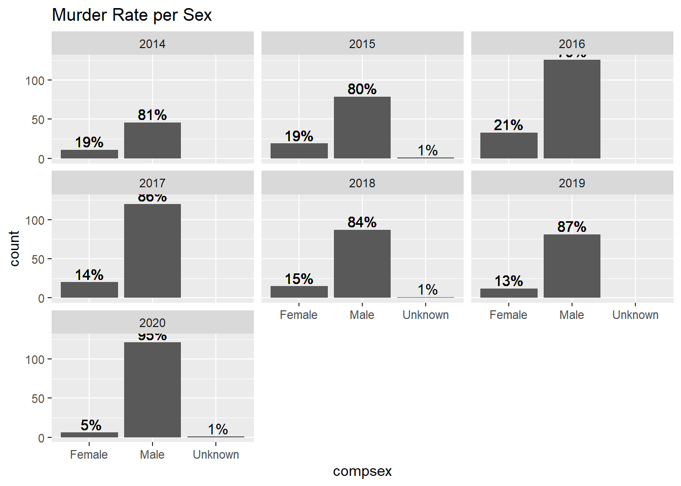
It appears that 2020 is unusually skewed toward male victims.
Putting this all together, let’s see if we can find the Age, Race and Gender classifications for victims that have the most significant changes over the last few years.
ggplot(Murder[comprace == "Black" & compsex == "Male" & compage < 30,],aes(x = servyr)) + geom_bar() + ggtitle("Murder Rate Per Year: Black Males Under 30")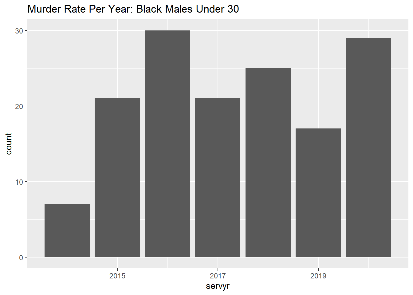
ggplot(Murder[comprace == "Black" & compsex == "Male" & compage >= 30,],aes(x = servyr)) + geom_bar() + ggtitle("Murder Rate Per Year: Black Males Over 30")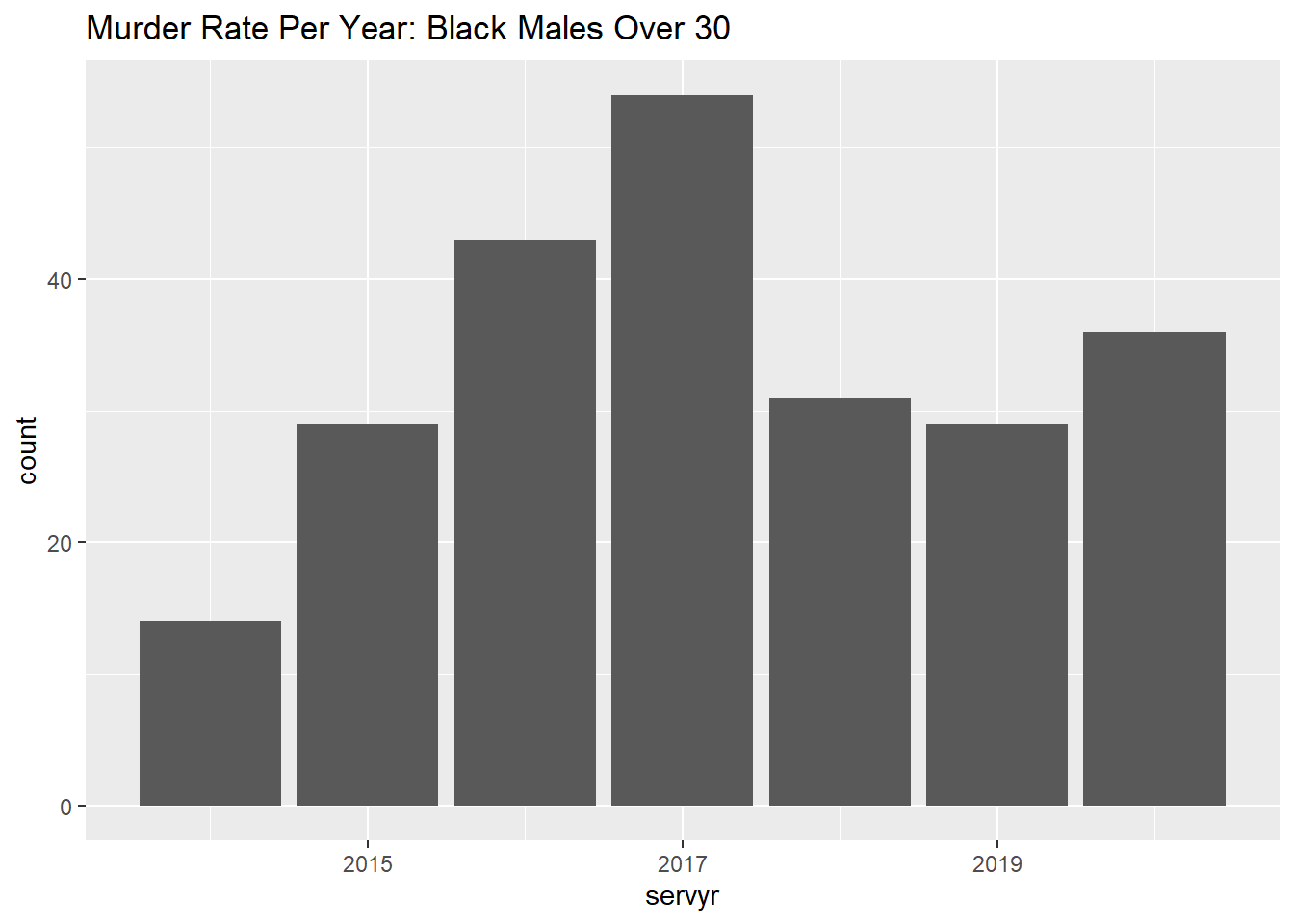
ggplot(Murder[comprace == "Black" & compsex == "Female",],aes(x = servyr)) + geom_bar() + ggtitle("Murder Rate Per Year: Black Females")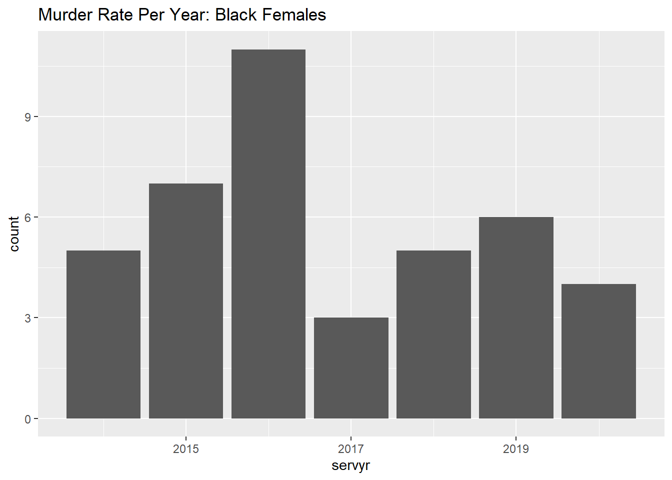
ggplot(Murder[comprace == "White" & compsex == "Male" & compage < 30,],aes(x = servyr)) + geom_bar() + ggtitle("Murder Rate Per Year: White Males Under 30")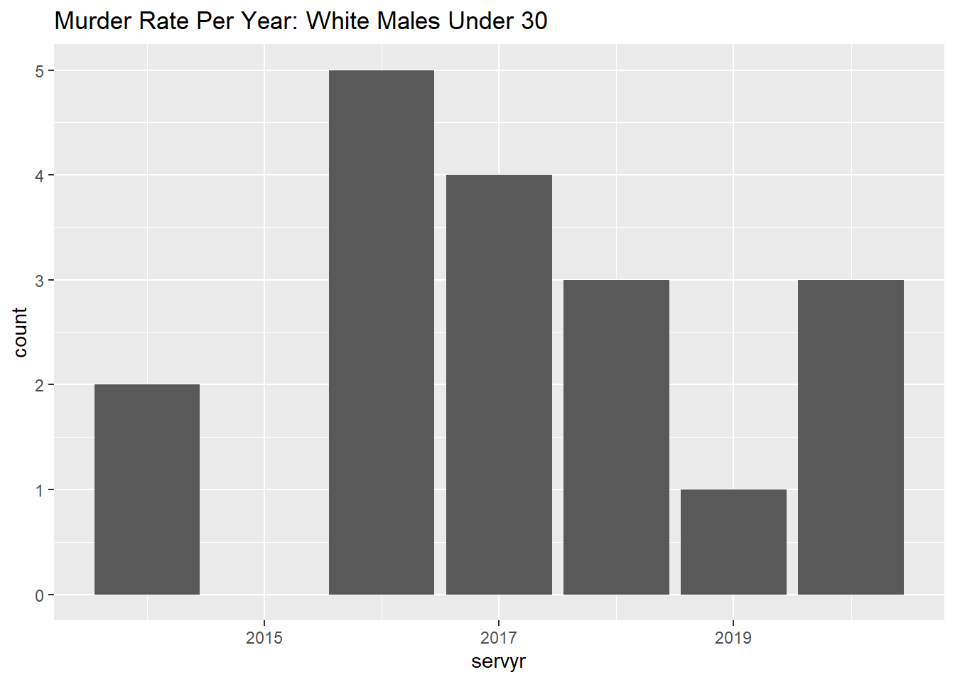
ggplot(Murder[comprace == "White" & compsex == "Male" & compage >= 30,],aes(x = servyr)) + geom_bar() + ggtitle("Murder Rate Per Year: White Males Over 30")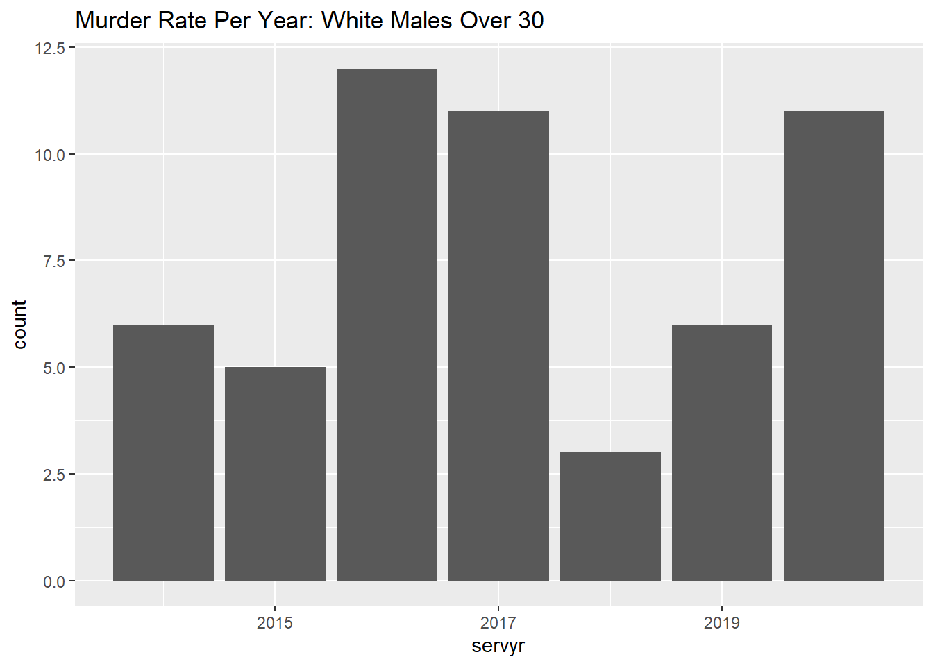
ggplot(Murder[comprace == "Hispanic or Latino" & compsex == "Male" & compage < 30,],aes(x = servyr)) + geom_bar() + ggtitle("Murder Rate Per Year: Hispanic Males Under 30")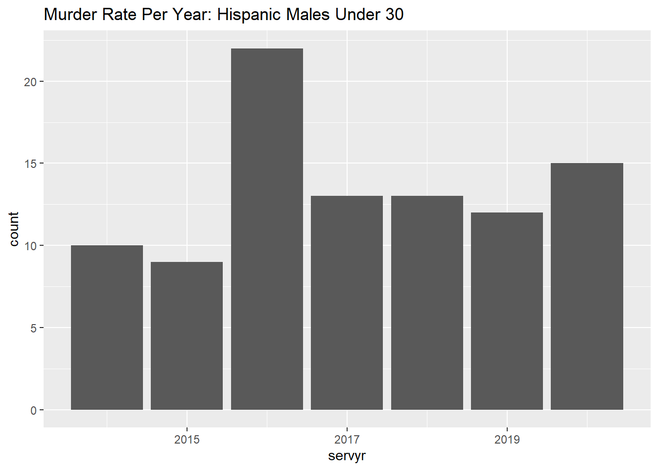
ggplot(Murder[comprace == "Hispanic or Latino" & compsex == "Male" & compage >= 30,],aes(x = servyr)) + geom_bar() + ggtitle("Murder Rate Per Year: Hispanic Males Over 30")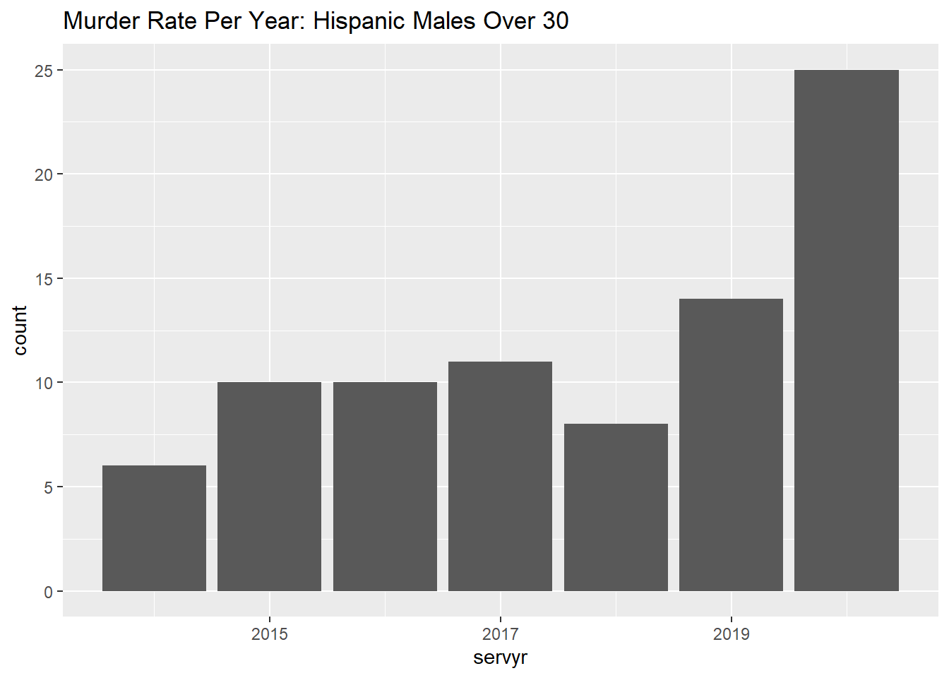
We see a significant increase in murders for White and Hispanic Males over 30 and a significant decrease in white males under 30.